THE LAYOUT:
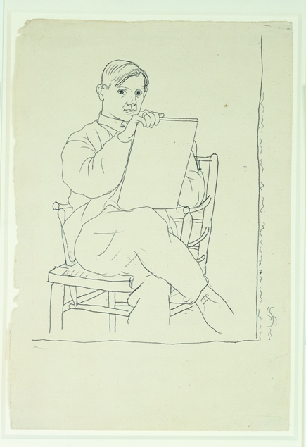
-Greeted by the delightful, wiggly lines of a contour self portrait of Picasso enlarged and pasted on the first wall.
-First room contains Cubist still lifes and a portrait, characterized by intersecting planes, an agitated treatment of surface, and a flirtation with pointillism and “assigned” colors.
-Second room is a loud, stylized, and informative video explaining Cubism’s controversy in wartime France.
-Third room is mostly Cubist works by Picasso and two by imitators, but also introduces three delicately shaded graphite studies of women, one of which is “Cubist”.
-Fourth room is a surprising and humanizing wall of photographs snapped of Picasso and bohemian crew in the streets, rooftops, and cafés of Paris.
-Fifth room is devoted to the ballet Picasso designed the costumes and set for, complete with a modern video of the production, original costumes on dummies, and costume design studies.
-Sixth room is transitory— varied cubist or classical works by Picasso and those in his new bourgeois posse including an unforgettable rainbow-aura’d clown.
-Seventh and final room presents more of his gorgeous “classical” graphite drawings— disappointingly not highlighted, but easily passed over on a back wall (surprising, as the contrast between these drawings and Cubist works would’ve served well to be presented in an easily contrastable side-by-side manner)—the first of his massive columnar women, and an intriguing canvas filled with little studies in all the styles previously displayed. There was a really nice museum guard who congratulated me on my art school acceptance (after asking why I was taking notes) and told me her field was hiring.
THE LOOKOUT:
Picasso developed Cubism with Georges Braque in the years immediately before the first world war, and like most new art movements, it was lauded as the End of Good Taste As We Know It. In the polarizing atmosphere of wartime, a nationalistic mob mentality emerged, condemning the conceptual new movement as something more than ugly— “Kubism” 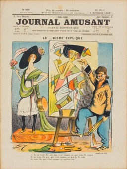 with a german K was reviled as a stain on the grand history of French classical beauty, and satirized brutally (and hilariously) in pop culture magazines. Seeing one culture’s perception of the aesthetics of another is fascinating, and undoubtedly, throughout history, these perceptions have been fed by xenophobia.
All of this was handily explained to me in the flashy video in the second room of the Barnes Foundation’s “Picasso: The Great War, Experimentation and Change” exhibit. Cubism, in a museum setting, is typically placed in a moment in time, which is reassuring— as a radical new development, people like to see it on a timeline, in context. For me, building an understanding based on more than just aesthetics is good, because much of Cubism makes me feel like i’m in a brown, dirty city in winter with a migraine.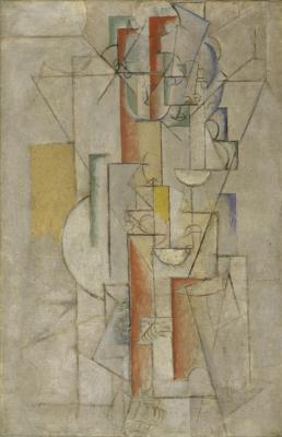 Now, that being said, the experience of being in a brown, dirty city in winter with a migraine is a valuable one. Cubism helps us understand the volatile nature of three-dimensional planes in space, how our eyes automatically seek to judge depth— and our unease when our eyes are confused. Highlighted by this exhibition, though, is how these aspects of Cubism spit in the face of authoritative aesthetics. Picasso was ostracized as a german sympathizer because the french perceived Cubism as “looking German”. This is amusing to me, because while Cubism can appear industrial and cold, it is really an inefficient way to depict things. (Perhaps even a single, but iconic, Dadaist
  work by a german artist would have been informative to the exhibit. One could argue that Cubism is a form of representational Dadaism, but that’s another can of worms.) I think Cubism could very easily be a lens into the psyche of any citizen of a country at war: trying to unite the intact with the disintegrating or splintered, and re-examining everyday objects or peers from harsh and conflicting angles, both which lead to an eventual existential deconstruction.
When Picasso started to produce more classically- styled graphite drawings, his peers and those who supported Cubism thought that all the negative criticism had scared Picasso back into “pretty” artmaking.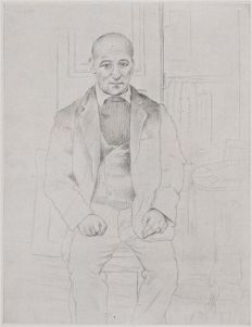 The pamphlet for this exhibition raises the issue of uniting “two apparently contradictory models”, but really there was no issue at all. To Picasso, those classical line drawings were the equivalent of going back to the drawing board. He needed to create a clearer body of work to find a way to precipitate a New Interpretation, a new style. You could not have those blocky, monumental, white-robed women in the last room without Cubism and the classical period of reflection before them.
“Picasso: The Great War, Experimentation and Change” displays works that “[oscillated] between styles”, but beyond blocking in the fact that Picasso’s work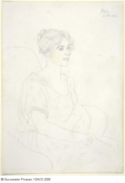 was informed by his relationships (whose isn’t?), and mentioning the harsh criticism Cubism received, I don’t know if there was much “exploration” created beyond showing Picasso’s own personal exploration. The main joy of the exhibit was seeing works by Picasso that I hadn’t seen before, but I felt disappointed in the lack of direct and structural contrasts drawn between different
 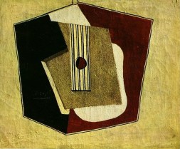 styles. The categorization of the rooms hindered a dialogue between works that I think would have been more explorative. The symmetrical organization of the Barnes’ personal collection may have informed this rigidity. I wanted flourishes, cacophonous organization that would speak to the innate and infectious rhythms of Picasso’s works.
For example, being introduced to the video of Parade before leaning into the beautiful costume sketches 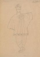 or turning the corner and being accosted by a twelve foot tall Cubist purple
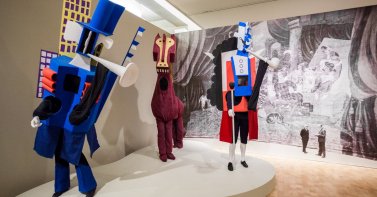 horse was baffling. It seems obvious to me that a viewer should be led through the process of a multifaceted, multimedia piece in a way that builds understanding and excitement organically. Seeing the final product first meant that you viewed the ballet with a lack of context, and in a way that separated it from Picasso’s own process.
That process, like the process of most artists after the downfall of the Patron, involves 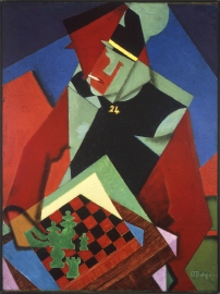 constant evolution, both of one’s physical work but also of one’s ego. An information plaque in the first room says that Picasso “regarded as facile” the imitative Cubist paintings of Jean Metzinger and Albert Gleizes. I regard them as more “facile” to look at than much of Picasso’s own Cubist works. They have pleasant, rich colors, interesting dissections of space—to my untrained eye, there is a difference in styles but no difference in quality. Picasso’s desire to keep moving Cubism forward was most likely driven by his own conception of himself as a bullish innovator.
 I can’t help but push back against the often contradictory information plaques on the walls of this exhibit. Certainly, Picasso did not intend Cubism to be an anti-France movement. He and Braque created it before any stirrings of war. He may have been annoyed with the reception and the “political meanings ascribed to Cubism during the war,” but I am not convinced that he “had misgivings about Cubism”—he just wanted to keep innovating. Perhaps he used the criticism as a suggestive launching point to practice using a more traditional french eye, but I think that was more of an experiment for himself rather than any kind of bending to public will.
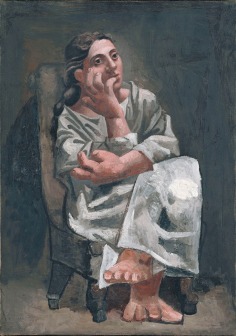
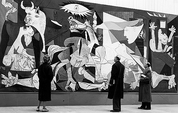
After all, there is unity in shape and line throughout the exhibit, no matter what style was manifested. A triangle of drapery in Seated Woman could have been collaged into a still life with Le Journal. Light sources are completely eliminated and do not shape form; instead the forms seem to shape a dull inner light. I am just frustrated with this exhibit that seemed like a shell, hollowed out but still beautiful. I do not know if I was merely expecting something more exhaustive or feel confused with the lackluster organization. I know that La Guernica, which is one of the most powerful pieces of war imagery ever created, was not even mentioned. I still love Picasso and his lines and his spine. But this exhibit didn’t show him grappling with concepts, his humanity, his anger and lust: aspects of himself that are so tied to the bloody canvas of war.


 notebook— taking notes, sketching, and writing down any ideas that occurred to me while looking at their exhibits. My parents would frequently bring me to museums as a child, and living in proximity to New York City meant I was no stranger to the Met, MoMA, and other large institutions with huge budgets for curation and facilities. The small Aldrich Museum remains, in my opinion, the best-curated museum I have ever visited.
 crush. But this kitsch, when presented within the context of a museum-wide celebration of “installation art and exhibition design”, was made meaningful. That entire cycle of artwork, called “Circumstance”, took objects of little artistic significance and arranged them with seminal works, transforming them into a patchworked vision of American life and history. Nancy Shaver’s, shabby, small cardboa
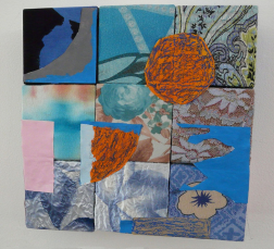 rd boxes modpodged with fabric scraps and acrylic paint, when bridged between the stark depression-era photographs of Walker Evans and the luxe textiles of Sonia Delaunay, became sculptural representations of the history of American folk-utilitarianism and the artist’s own yearning to show a reconciliation between disparate socioeconomic classes. Displaying those sad cardboard boxes seemed to me an experiment the Aldrich embarked upon: just how much can we flex our curatorial muscles? How far can we push the power of exhibition design? The experiment succeeded. When I left that room I was amazed at how illuminated those cardboard boxes had become to me.
 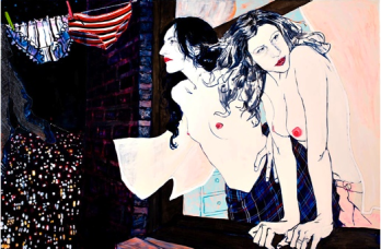 memories. I first saw Hope Gangloff’s work there in 2011, and I remember feeling like I’d entered a world that made more sense than my real one. It felt like what my grown-up life would be and look like, painted or drawn in an illustrative line quality that rang truer than eyesight. It helped that she didn’t shy away from many of her subjects’ “distinctive” noses (as mine has been called) or natural gawkiness. Gangloff’s work wasn’t difficult to understand: it
  was a dialogue with her and her artistic friends and peers; what she wanted to highlight within them, how their messy world spilled onto them; the anxiety of b
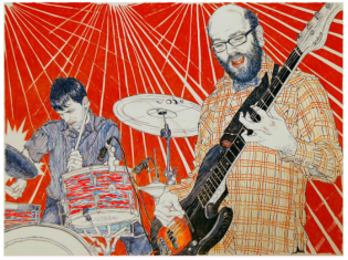 eing in a changing world and rushing to document it. Lush, clashing patterns encased humans somehow simultaneously sickly and robust, smoking in rooms carpeted in socks and the bright packaging of Brillo pads. I stood for at least 20 minutes in front of a long-limbed woman splayed on a lake deck whose flip-phone, whatever it displayed, was knitting her eyebrows together. Gangloff is still one of my favorite artists.
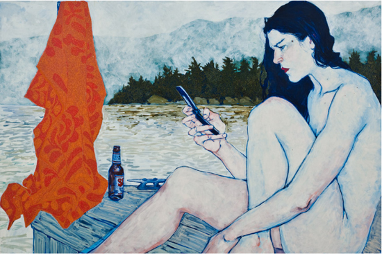
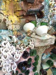 near the murals of Isaiah Zagar, the creator of the Philadelphia Magic Gardens.My ex-boyfriend, visiting from Pittsburgh, went to the Aldrich with me and ended up including an analysis of Michelle Lopez’s nine-foot tall Blue Angel sculptures, installed in the Aldrich, in a paper on Heidegger. I visited a cardboard reproduction of a portion of the Trevi fountain installed outside the museum no less than five times in the months it was slowly decomposing in the rain,
 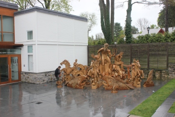 because it never failed to make me smile during a particularly difficult time in my life. The Aldrich was My Museum. I visited when I was in love or heartbroken, bored or busy, and always got some epiphanic experience out of it.
  Community building, especially in an often insular art world, is an extremely important thing to me. With this exhibition, the Aldrich became part of a community of small museums supporting each other, and forever solidified my love. A seven-pronged street sign pointed the way to each of the other museums to visit. I made it to four.
 about ideas of art and artifice, and the way that art helps us look at things anew.” The Aldrich keeps this room because it forces viewers to look at length at something they don’t understand– and then realize that they are within the art itself. As a child, frustrated with my peers who ran through the museum without glancing at the art, being able to sit in this dark room with them and come to an understanding together was a gift that made the bus ride back to school much more tolerable.